YARD Co
Store design, Logo, Merchandising, Visual merchandising
- Philadelphia, PA
- Princeton, NJ
- Stone Harbor, NJ
- Lambertville, NJ
1995-2001
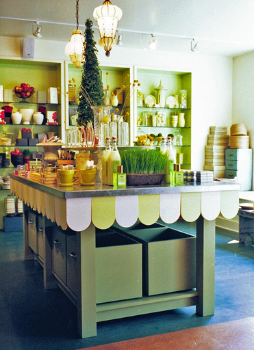
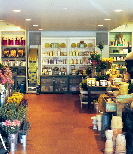
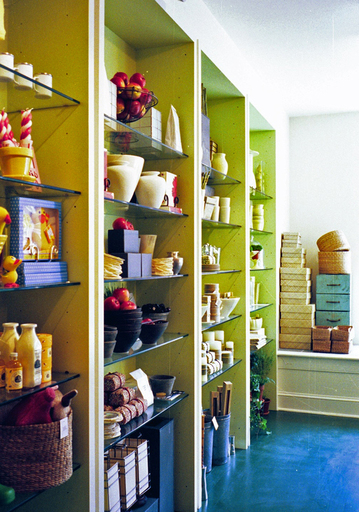
In 1991, we wrote a business plan for a store called Gardenesque. For a number of reasons, chief among them our naivete about fundraising, we put the project on the back burner. Five years later, two brothers from Philadelphia came to us with a business plan of their own, similar enough to Gardenesque for us to dust off our plan and merge it with theirs. Once the concept was finalized, we developed the name and corporate identity for the company, tightened up the merchandising, designed the stores and developed a visual merchandising program.
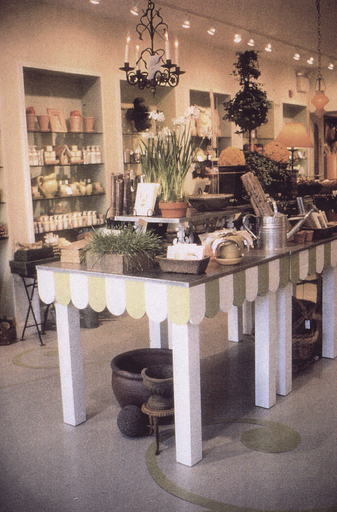
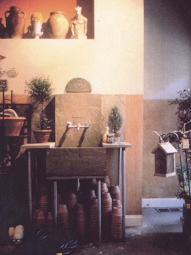
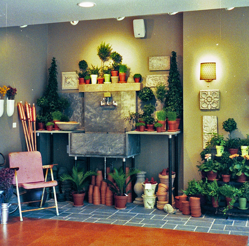
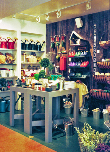
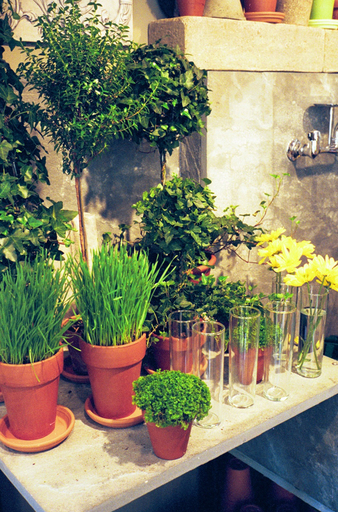
The name describes the point of view. Yards are inseparable from the American lifestyle. Yards are where many of us spend our outdoor time. But the concept is expansive. Included in the idea, and in the products sold at Yard Co, was a general garden sensibility including the romance of an English garden, the formality of a French garden, the serenity of a Japanese garden and, of course, the casualness of an American park. The stores were designed to capture that spirit.
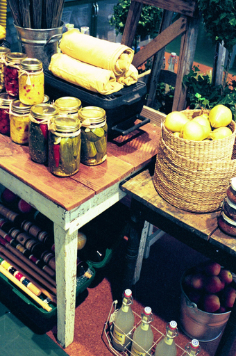
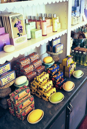
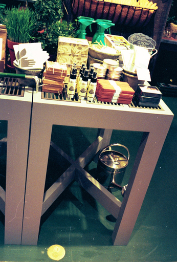
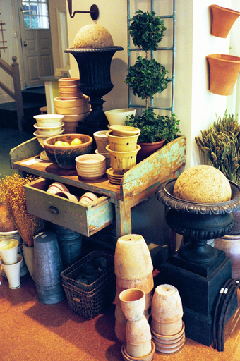
The stores were organized in three parts: a front room for decorative accessories, a middle room for tools and gardening gear, and a back room for plants, antiques, and garden ornaments. The presentation of the merchandise was a key ingredient in the Yard Co concept. The store was broadly construed as “collection” merchandising. The merchandise could be themed by function, color, style or material; it may tell a picnic story or a pet story or a white story, it may be a classically inspired, or Zen inspired, or all about birds.
