


MIT Technology Review
1 Main Street, Cambridge
Office renovation study, 2015
Click on first image to view as a slide show
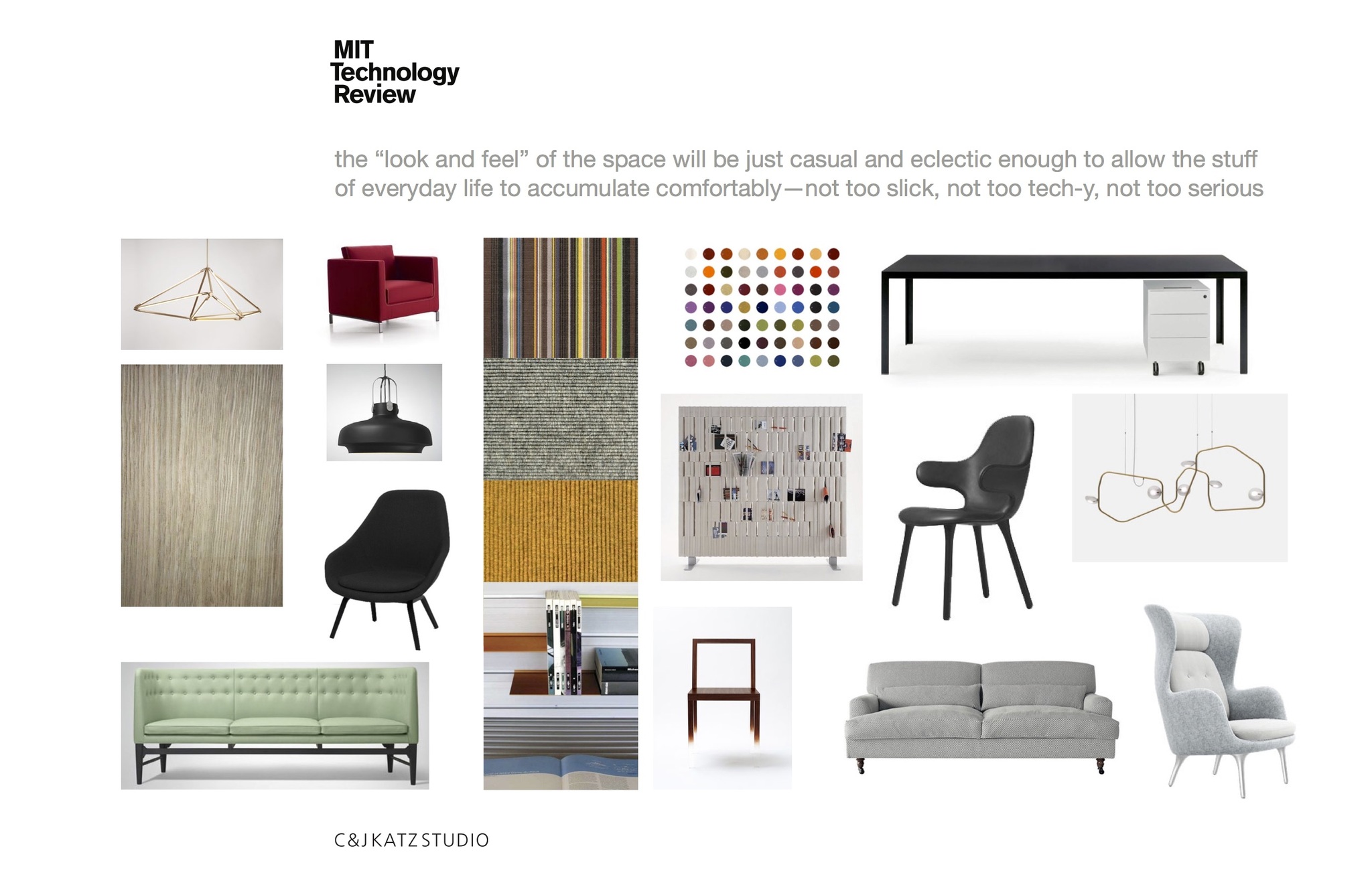
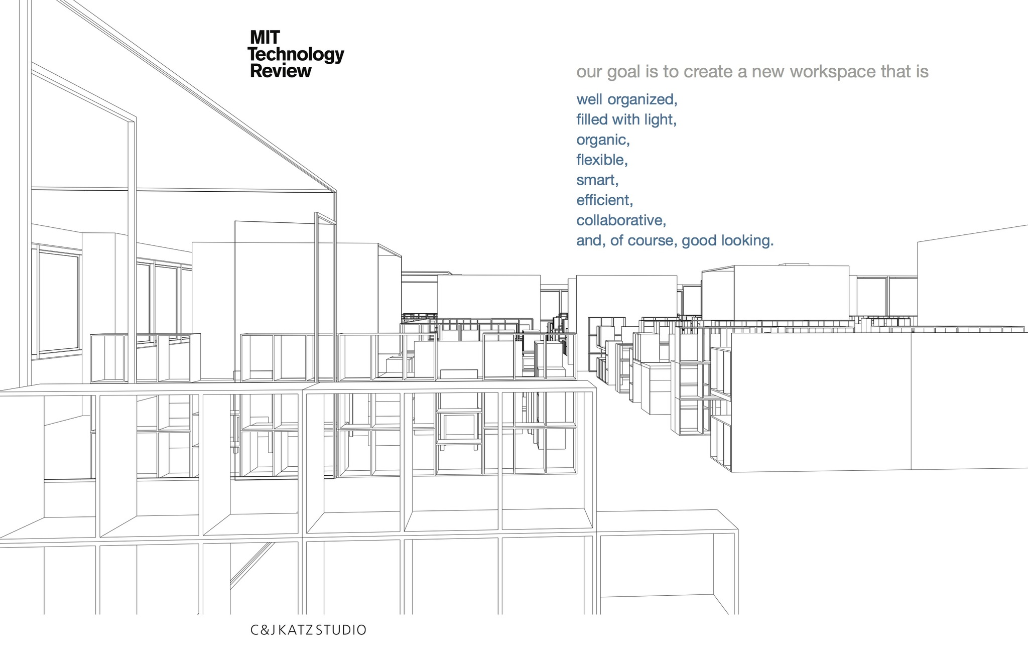
Because they were taking on a new project, MIT Technology Review needed to add 15 more people to it's already crowded space. They liked where they were—a great location along the Charles River with incredible views—so rather than move they decided on a complete overhaul. The layout of the space was outmoded: a hierarchy of corner offices for the executives, large offices along the windows for editors, and cubicles in the center of the space without natural light or view for everyone else. Jason Pontin, the editor-in-chief, asked us to rethink the space so that it would be flexible, collaborative, less hierarchical, and have the look and feel of the creative endeavors that were so much a part of the work that goes on there.
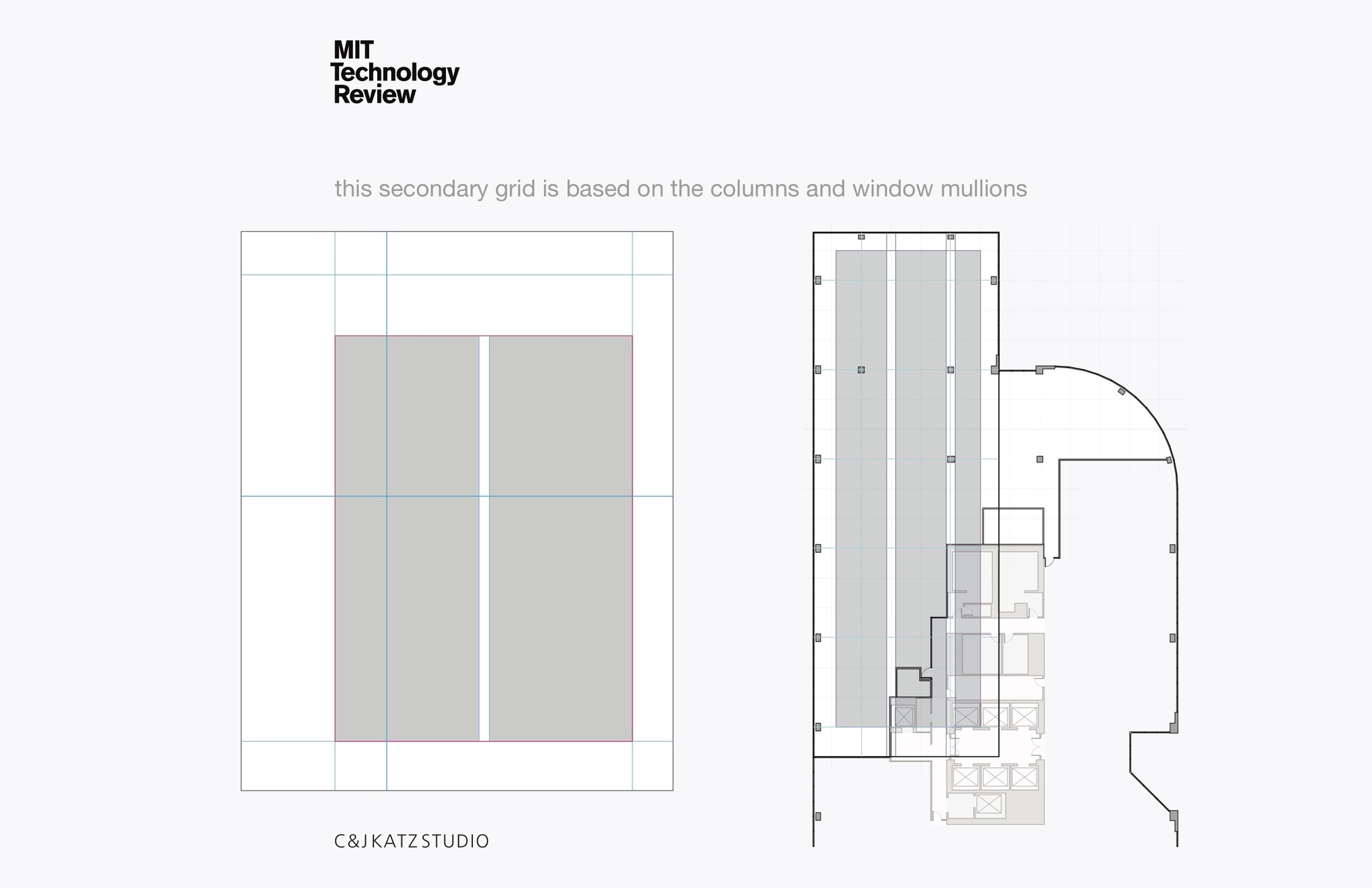
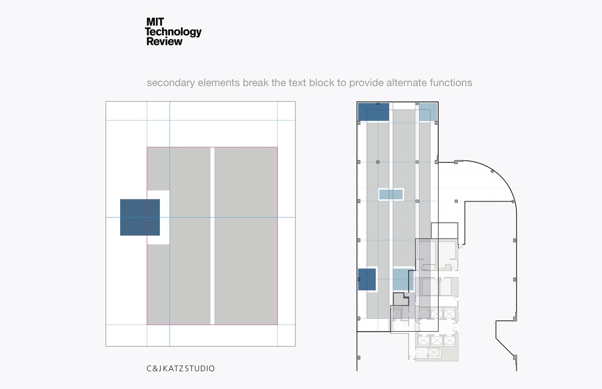
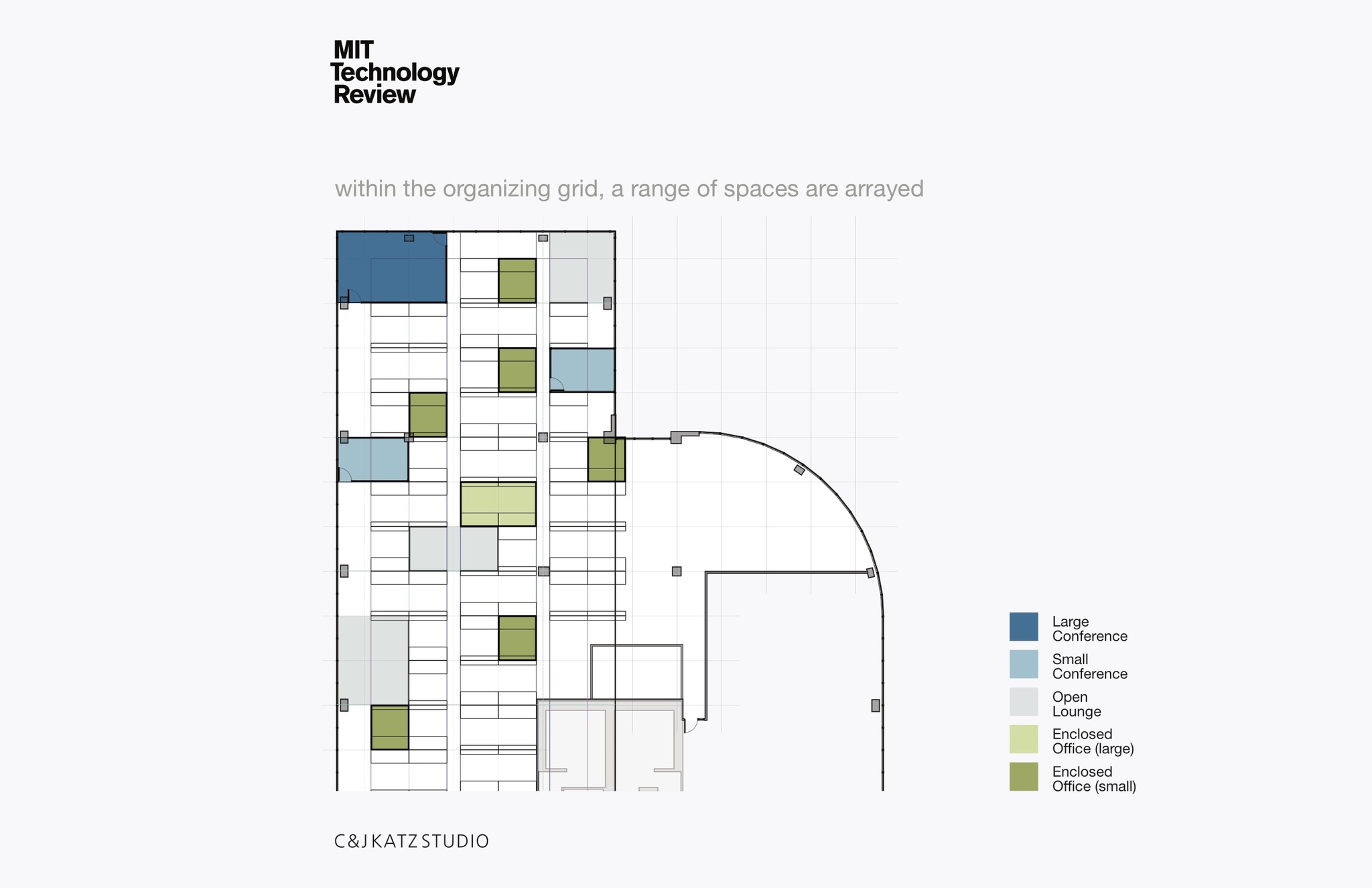
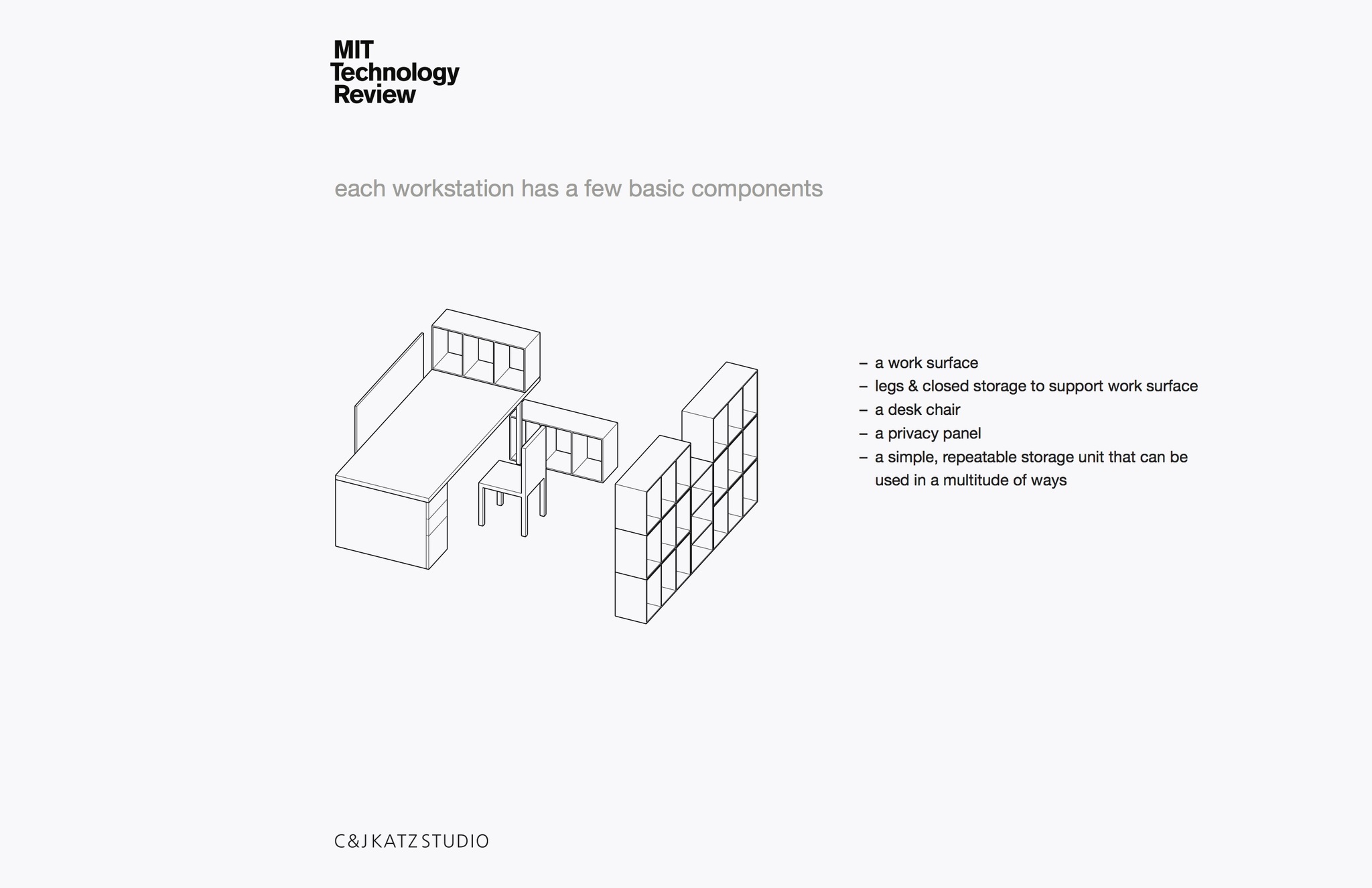
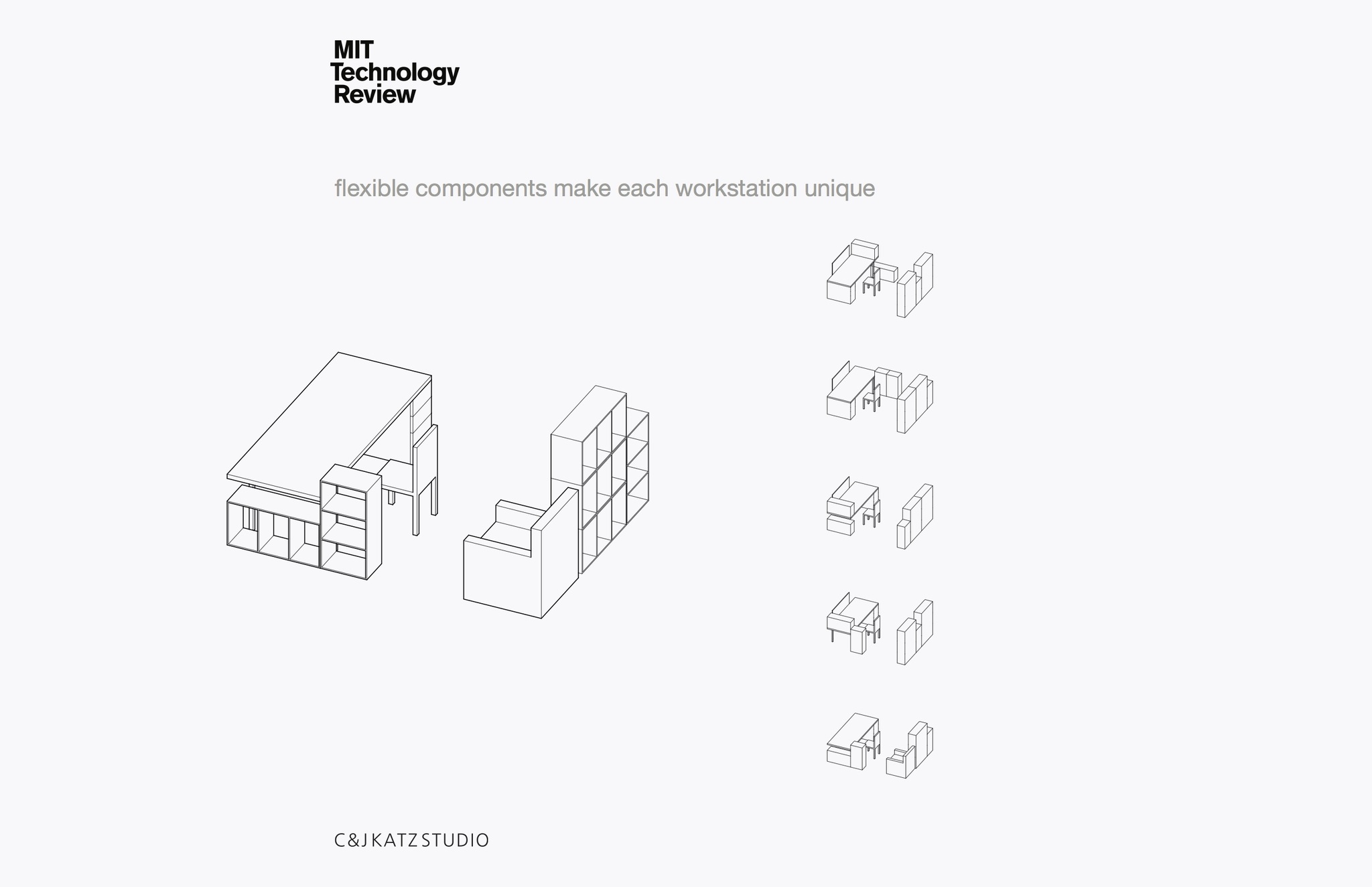
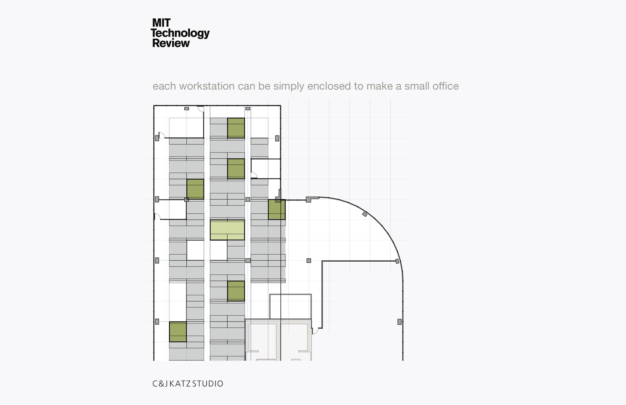
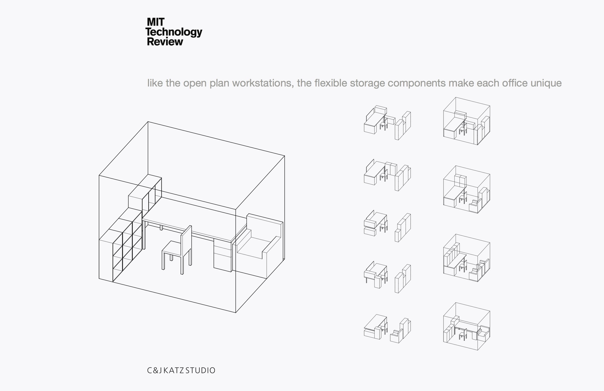
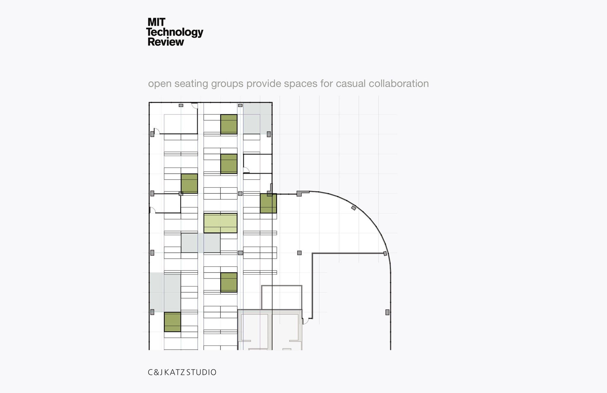
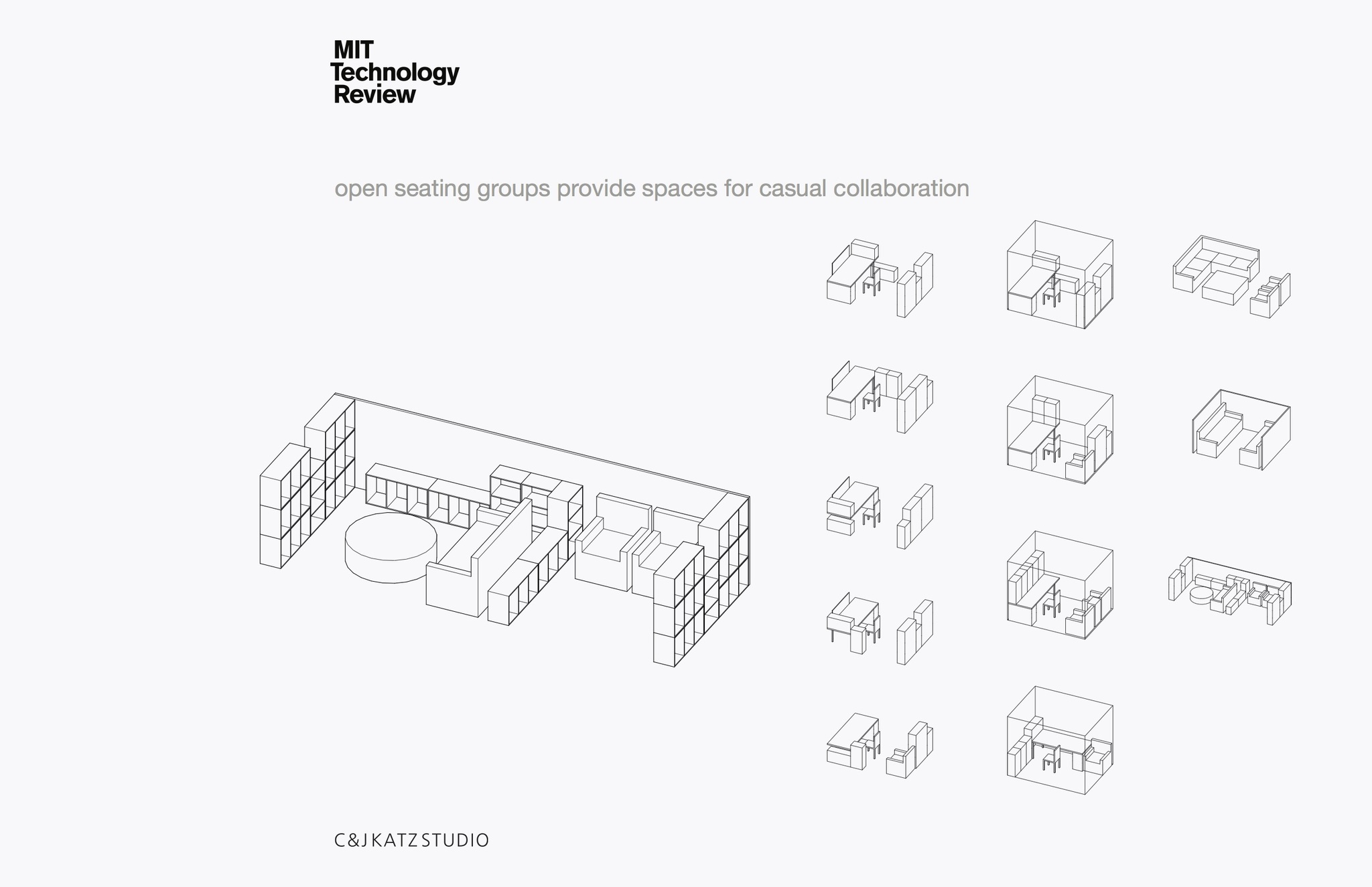
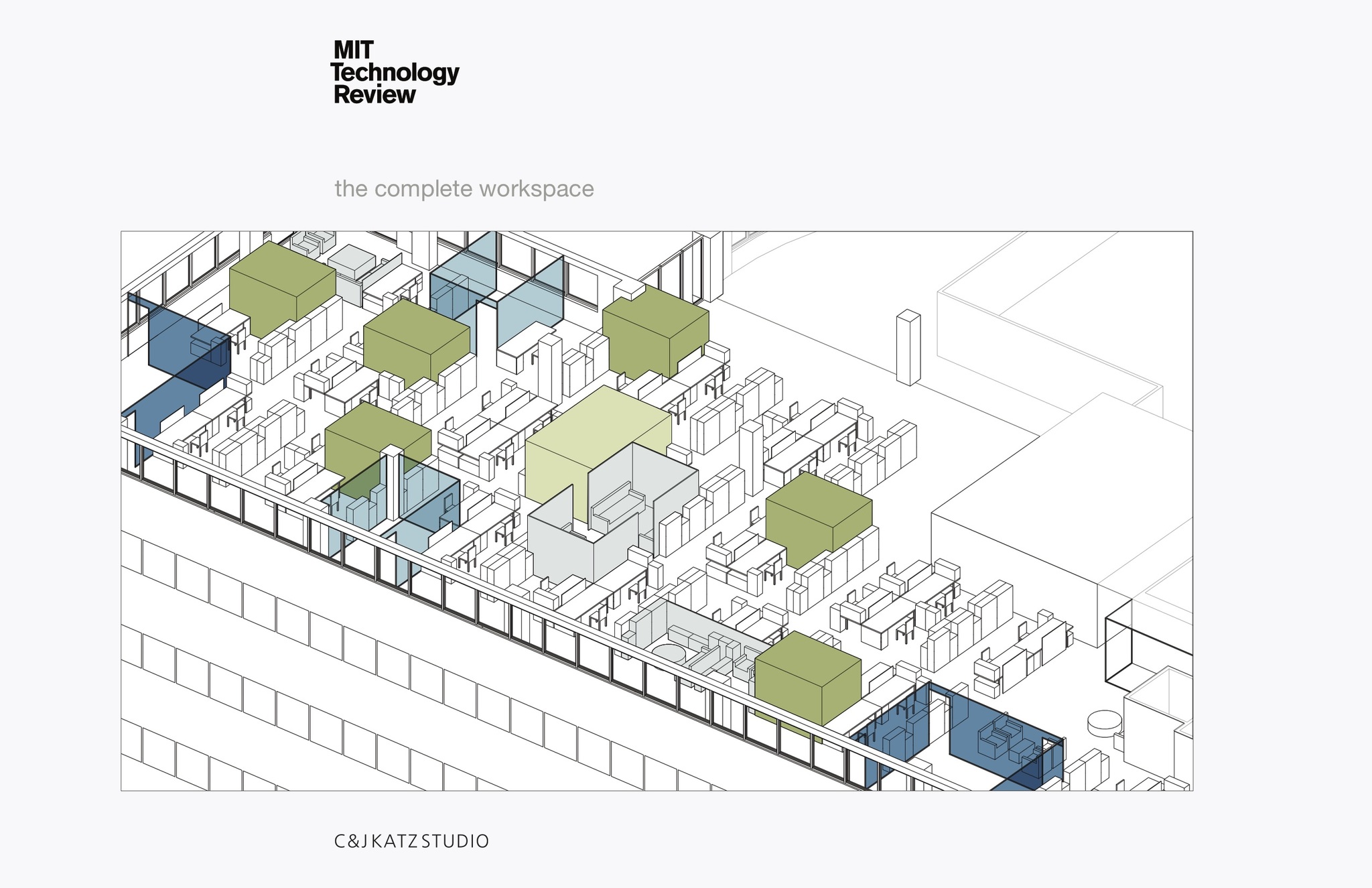
The idea was that everyone had the same size workstation and if editors still needed offices, their workstation would be enclosed, mostly with glass. There would be plenty of meeting spaces in a variety of sizes, and the perimeter of the space would be open so that every employee has access to light and view. The furniture system is inexpensive and low-tech but, with only a few components, allowed for multiple arrangements.
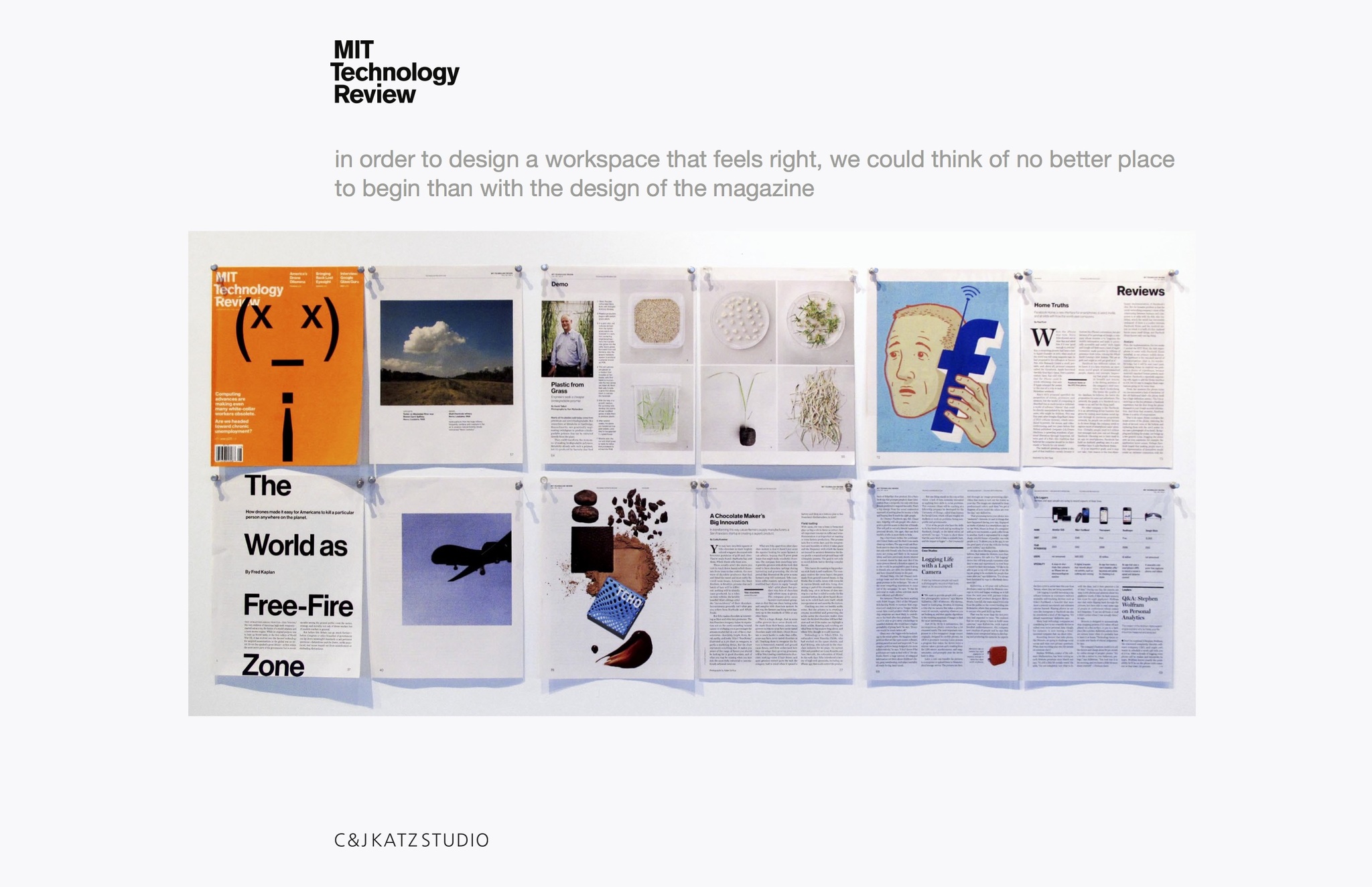
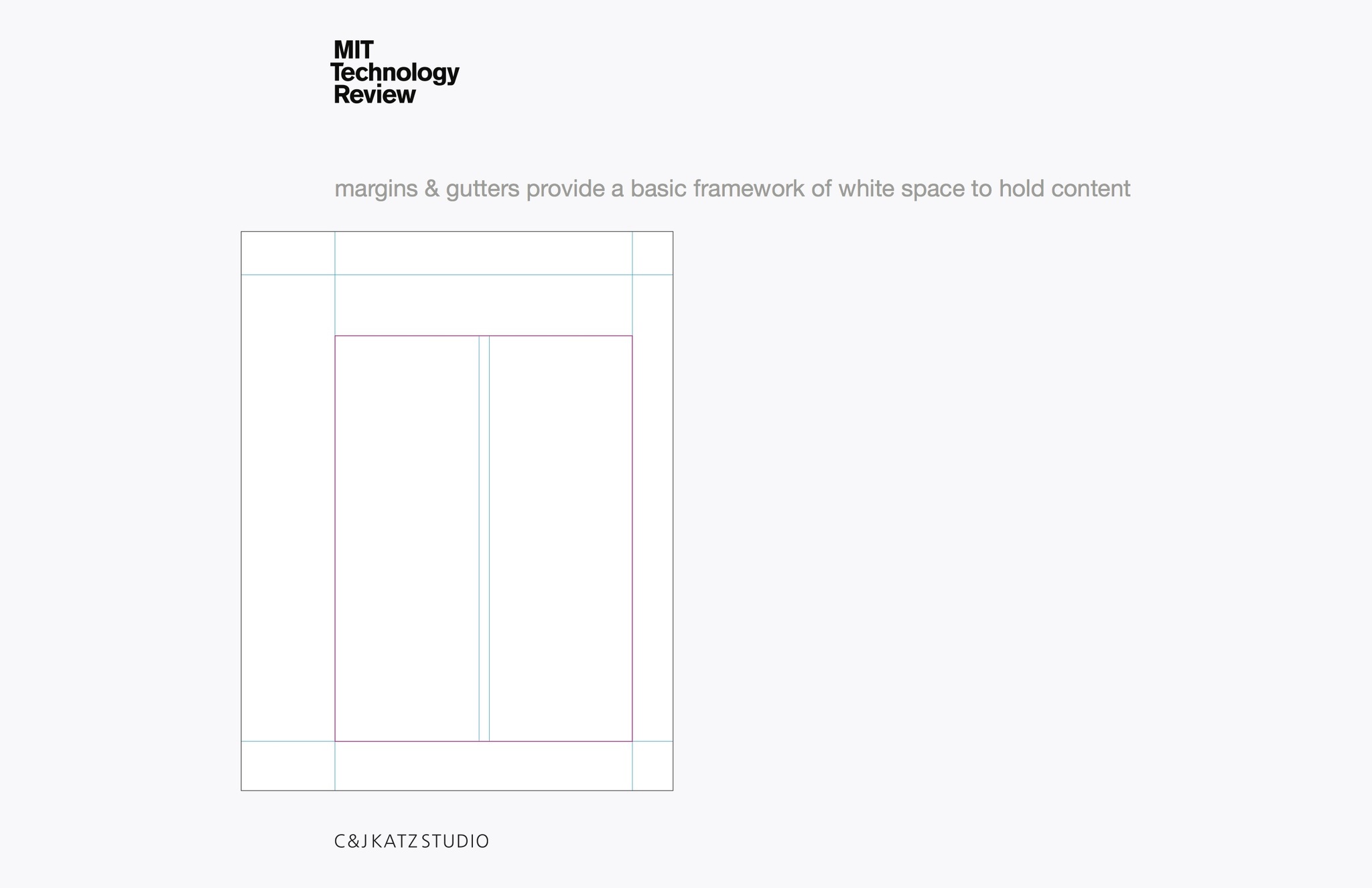
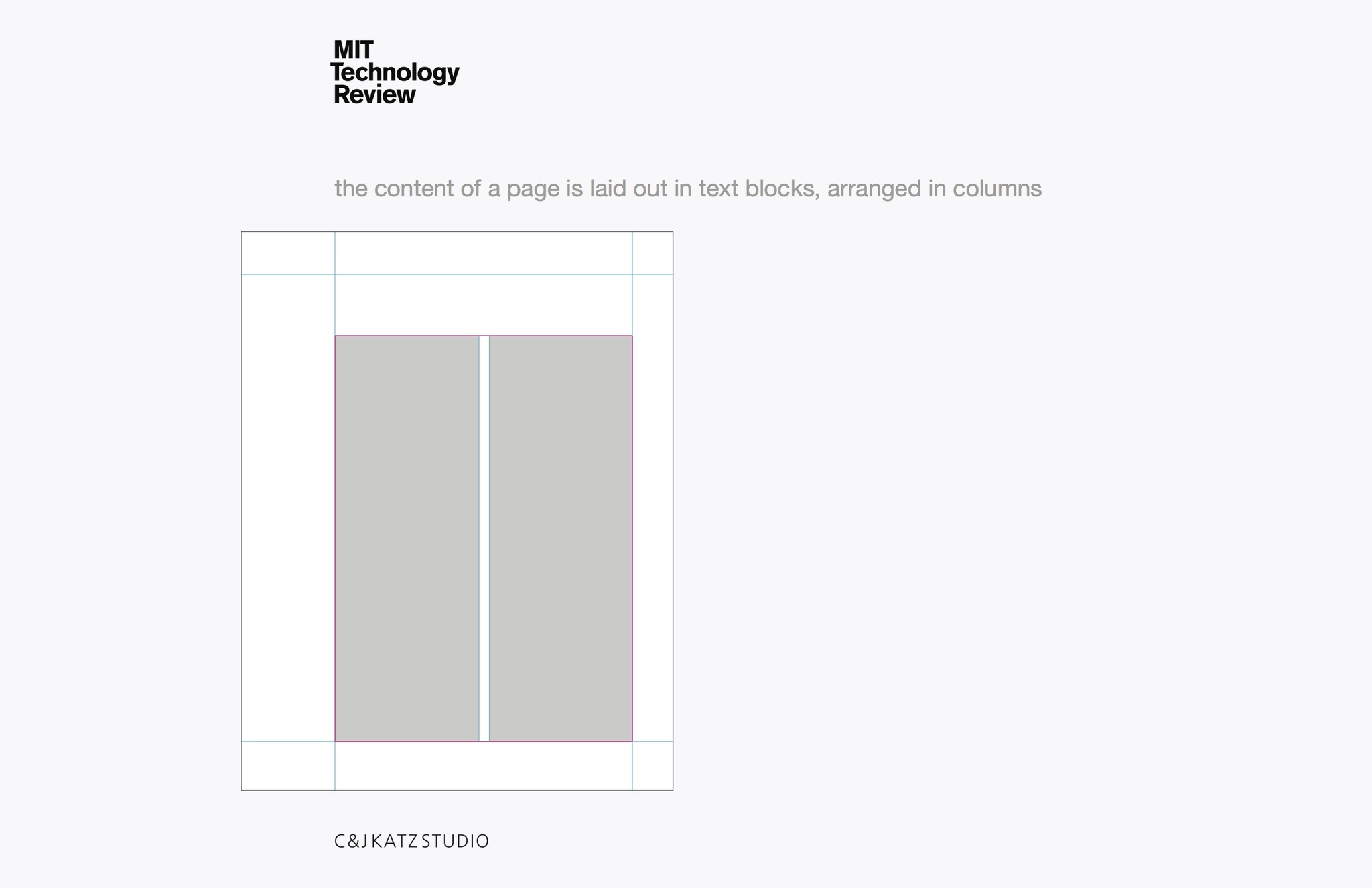
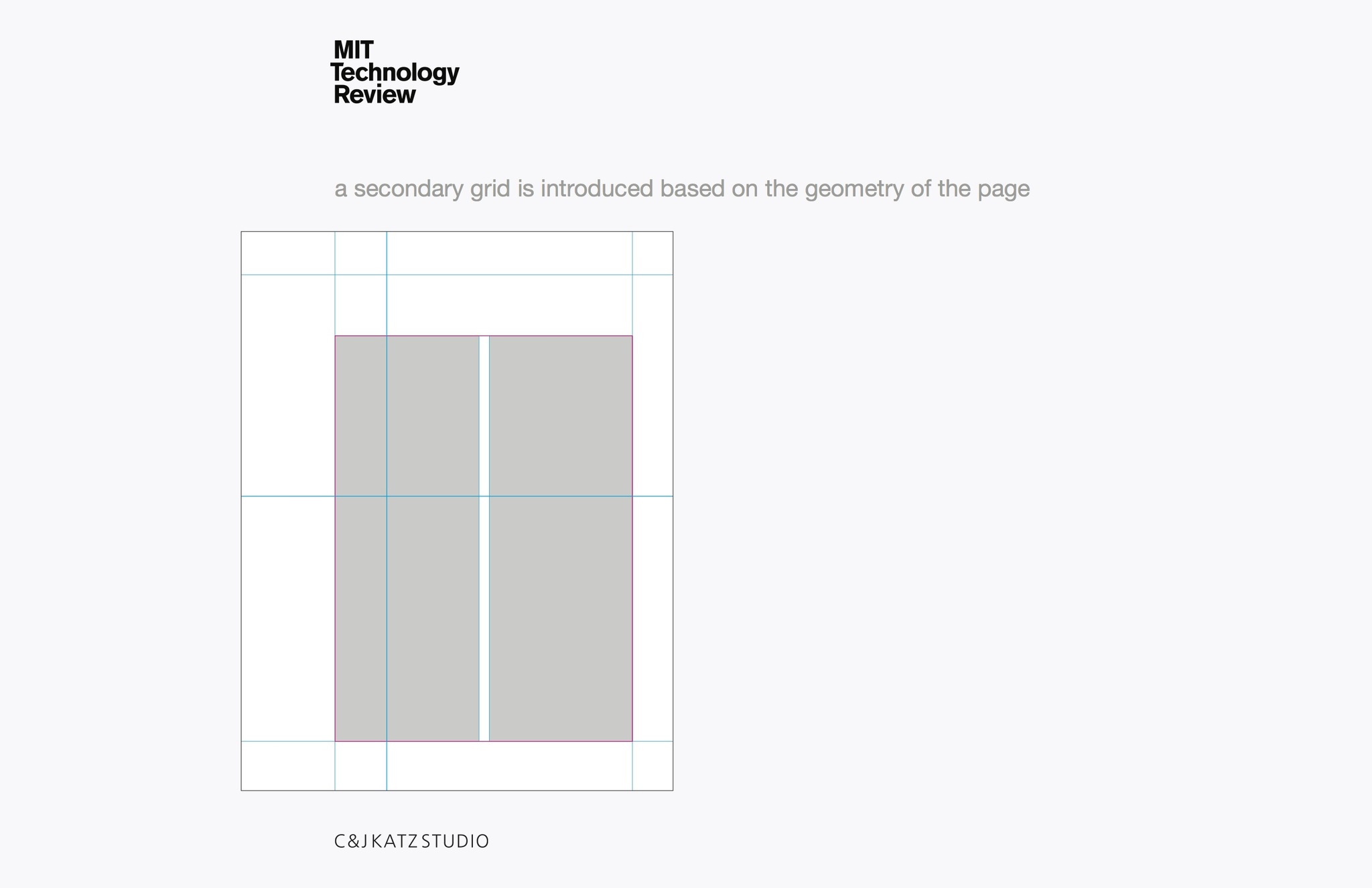
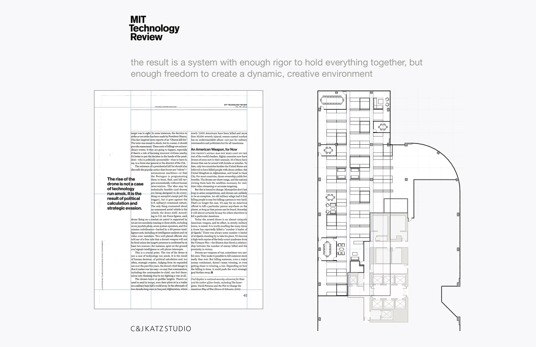
These slides—from the first presentation to the client—describe our thought process about how to achieve their goals in a manner that reflected a new vision for the brand. It is a good example of how we approach design.